Portside Rebrand
Updated: Jun 4
From humble beginnings
After a few years of flying by the seat of our pants, taking opportunities as they came and the expansion of Portside from one to four venues, we realised that we had changed in our 6 years of operation.
We felt like the old brand wasn’t quite aligning with who we were anymore - we were fast outgrowing it - and it became noticeable when things slowly became more inconsistent across venues and channels.

The "why"
Over time, we noticed that we’d been trying new things like colours and graphics to the point where lots of things in-gym felt mismatched and inconsistent. It all came to a head during the development of our old website. We became fixated on how different it was to the in-gym look and feel, specifically, a squiggly graphic that had never been used before. It seemed small at the time, but it brought to light how much things had changed. It wasn’t something we were totally happy with, and that was when we decided it was time to rethink things.


What it needed to be
We identified that the brand needed to be more approachable for new climbers, while still remaining credible and relatable for experienced climbers. We’ve always been the same at our core, but we know it might not be obvious to many - including those new to Portside. We needed our brand to communicate a stronger and clearly defined sense of identity.
The process
So, we got to work. We spent a few months researching other international and national bouldering gyms, keenly listening to our owners and staff bringing back stories, photos and experiences from gyms they visited in Europe and overseas.
We sat down with our head setter - a veteran of both the indoor and outdoor climbing worlds - and talked about what he felt shaped us and what was important not to lose. We ran focus groups with community members from all walks of life to get a better understanding of their perspective on the brand, what they felt we could do better, and also to share with them our thoughts on it all. It was enlightening, and we like to think everyone came out better from it.
Once we had gathered enough research, we consolidated everyone’s notes. From there, we were able to define Portside: who we are, our values, our beliefs and outlook.
To keep it relatively brief - there was a lot of head scratching and discussions. Plenty of times we wrote and rewrote our thoughts. Too many Pinterest boards and other reference boards to count. We explored a few zany ideas, like do we go in a completely different direction and amp up the experimental and wacky illustrations and graphics? Then quickly realised that wouldn’t be a sustainable or consistent way for us to deliver messaging.
The biggest challenge we faced was getting a clear and united vision on what everyone thought Portside should look like, visually.
What actually changed
Finally, we got clear on what direction we wanted - something that aligned with (almost) everyone.
Visual identity
We wanted the logo, fonts and colours to feel organic, relatable and grounding, but also reflect our individuality and willingness to try new things. We settled on these ones.

Logo
We moved away from hard edges and corners seen in our previous logo. Our new logo is a soft, organic take on the letter 'P' that feels welcoming, not aggressive, yet instantly calls to mind the textures and shapes of a natural climbing hold or a flowing route. – Harrison, Graphic Designer

Design system
We wanted the brand to feel welcoming and we built a visual system that can keep up with our constantly evolving spaces and experiences. It has been fun to explore hand-drawn lettering on our merch to keep that gritty, hands-on soul of the sport alive. Since climbing gyms are already a chaotic explosion of color, we kept the palette focused: a deep, grounded green that feels like the outdoors, punctuated by a high-energy pink that captures the adrenaline you experience while climbing. I am constantly surprised and learning new things about this new brand everyday and am excited to see how it is interpreted and built upon. – Harrison, Graphic Designer

Fonts
We chose a mix of fonts that work everywhere from the gym floor to your phone screen. Our main font, Acid Grotesk, is clean and easy to read, which gives us the flexibility to stretch and twist it to look like climbing routes and boulder problems. We pair it with Co-Fo Drifter, a slanted font that grabs your attention and is great for technical details on things like our climbing shoe guide. Finally, we use custom, hand-drawn lettering on our merch and posters to capture that gritty, hands-on feeling of climbing. – Harrison, Graphic Designer

Medals
The new design was inspired by the olympic medals from the 70s and 80s, with ridged lines and variegated depths. In it, our new Portside P logo, dubbed “the squishy P” by staff.

Tone of voice
Our tone of voice was refined slightly, honing in on staying casual, like speaking with a mate. It hasn’t changed much - just become more consistent across all channels.
Colours
Climbing gyms are already packed with colour and action, so we needed a palette that could cut through the noise without adding to the chaos. We paired a deep, calming green with a bold, high-energy pink, giving us the perfect balance between a grounded, natural feel and that extra spark of adrenaline. – Harrison, Graphic Designer
Physical spaces
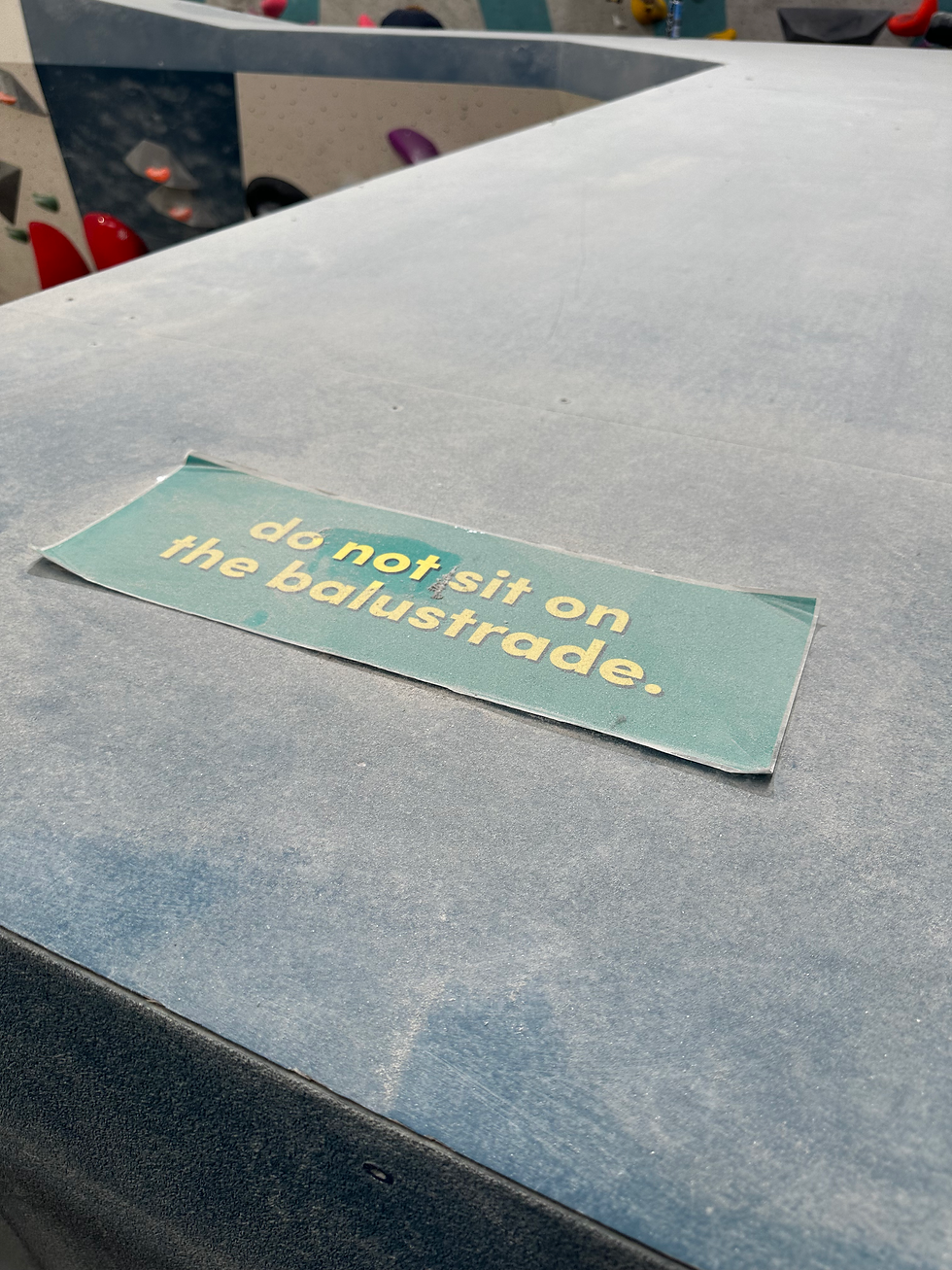
One of our biggest tasks was redesigning every piece of signage in the Portside venues. We’re still working on getting some things installed and some things will take a little longer - but it’s slowly getting there.

Digital
Our Instagram had a big transformation - with new colours and specific event branding running across each event. Icons have been changed to the new colours, along with fonts and imagery we’ve used across all our classes and events.

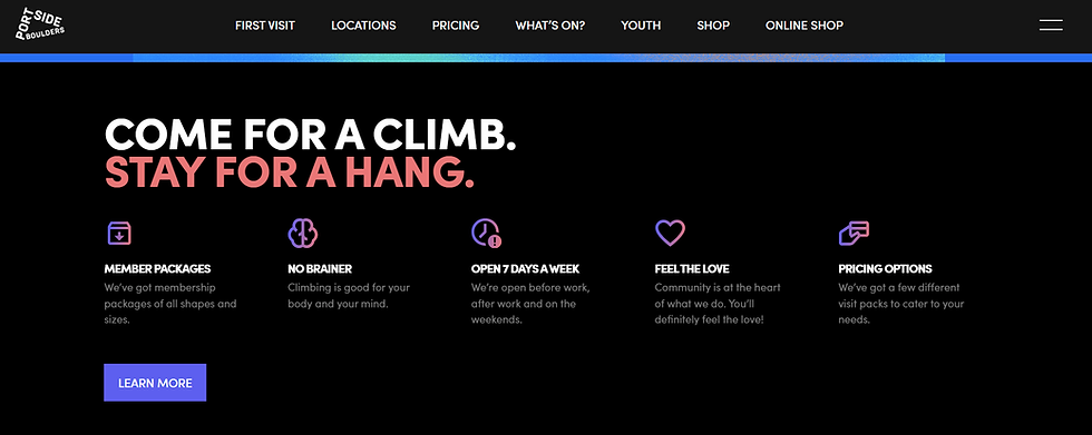
Instagram wasn’t the only one that got a facelift. We also did a massive in-house website re-design to go along with our new brand. It’s more user friendly and easier to navigate than our old one.
You would’ve also noticed our monthly emails have a new illustration for each month name, along with our new colours.
Illustrations
We developed brand illustrations to capture the natural world and the rough, rocky environments of Australian outdoor climbing. We spent a great deal of time developing the illustration style, experimenting with shape, texture and a blend of smooth and jagged forms. The result is a warm, handcrafted style that is distinctly un-polished.

As projects have progressed we’ve had to further develop the style to showcase more detail and rely less on abstract shapes. Starting from simple shapes and ending with scratchy, halftone illustrations, we’ve created a scale of detail that allows us to dial the complexity up or down depending on the message. Despite this varying level of detail the illustrations are tied together by distinct rough edges, mixed line-weights and careful colour choice. – Angus, Illustrator
Photography
Our photography stems from multiple photography streams, blending the spontaneous, candid approach of street photography, the narrative depth and real-life focus of documentary photography, and the intense excitement, drama, and action of sports photography to create images that are both engaging and meaningful.
Focusing on the raw intensity of climbing, the physical and emotional challenges and the vibrant community spirit, it tells the story of the climbing experience, highlighting the connections between climbers, their personal journeys, and the dynamic nature of life at Portside. – Sonny, Photographer / Videographer
What stayed the same
As mentioned earlier - at our core, we’ve remained the same. We’re still many people’s third place, and that isn’t changing. We’re still authentic, run by a local team that genuinely cares about our community and the people. We’re still US. We still value and believe in the quirky and fun contributions to our brand and community that everyone offers.


What it means for the community (you)
More consistent branding and messaging (especially signage) which will help you understand what we’re communicating. More relatability in our photos and imagery that we use - you might even see yourself in our People of Portside posters! You’ll notice our new branding in the form of signage and flyers first - especially when you’re around the gym. Basically, it’ll all look a lot more cohesive and just make sense when you see it.
The... end?
We know we’ve still got lots to learn and probably more changes to come in the future. But for now, this is who we are - and we’re happy with it! Thanks for being part of the journey that’s made Portside, Portside. Our community is what makes us who we are, and we hope that you can see that reflected in how we communicate.
Love,
The Portside Media Team